Foods of Athenry Re-brand
Re-brands rarely entail starting from scratch. Even when an existing range is badly designed, there’s usually equity – a recognisable feature like a colour that can be, or should be, retained. Unusually, the old packaging for Foods of Athenry featured plenty of good design; some charming illustrations, some engaging typography and a feel that was quite contemporary. What it lacked was coherence and strong brand cues. So, when we redesigned their product range of dozens of cookies, cereals, cakes and bars, our main job was to create a consistent structure that would give the brand presence and personality on-shelf. The redesigned FOA logo was placed in a consistent position and size and we made great use of the purple brand colour. The new range is now instantly recognisable.
Inishella for BWG
When BWG bought Heaney Meats in Galway, they inherited a rather un-loved retail meats brand called Glenmor. Glenmor was already selling into BWG stores so, as new owners, BWG took the opportunity to refresh the brand. We developed the new name, logo and look and feel. At the start of the project we identified two of the mistakes Glenmor had made. One, there was no brand colour. Two, the overprint area which covered a third of the label had been left white. These two mistakes meant Glenmor had no brand presence or personality on shelf. Just fixing these two mistakes made a huge difference. Our in-store 3D visuals are a great tool for pre-visualising the appearance of stock on shelf. Our after launch photography proves how effective the new brand is.
John Stone Beef
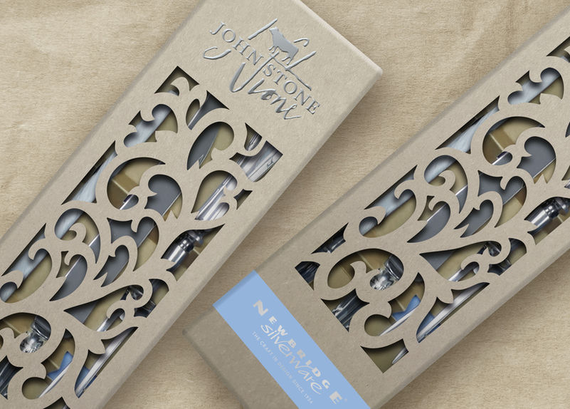
Once the initial fanfare of a launch has quietened, some brands consider the process to be complete. We believe at that point we’re only getting started. A launch can be seen as an introduction, continued brand development allows our clients to build on the initial momentum of launch, develop relationships, deepen connections and build trust. Having created the brand for John Stone Beef (details here), we looked at ways to extend their presence into their customers’ daily lives. By providing genuinely useful and desirable assets for their businesses, we could solidify John Stone’s position as not just a supplier but a partner to chefs, restaurateurs, hoteliers and fine foods merchants. Amongst the range of goods we designed and sourced were bespoke Irish beech menu boards, sleek, magnet clasped sample boxes, traditional printed butcher’s greaseproof paper and letterpressed certificates of authenticity framed by hand to gallery specification. One of our favourites is a truly beautiful steel barbecue set produced in Maniago, Italy, the ‘city of knives’ where artisan blacksmiths have been crafting steel since 1453. With each and every item we took our lead from John Stone himself, combining traditional craft, state of the art technology and sustainable production techniques.
John Stone is a great example of what we can do for a client. See the journey here:
McCambridge Bread
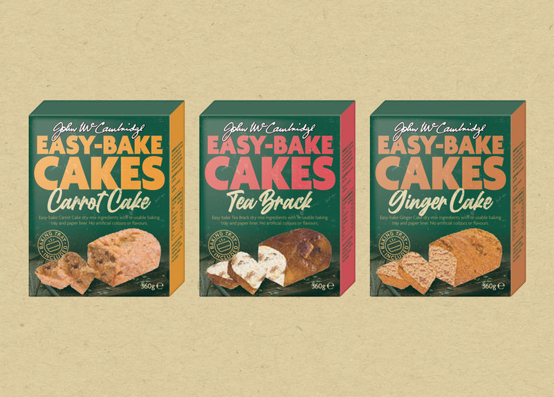
It’s been a privilege to be entrusted with design responsibility of one of Ireland’s favourite food brands. McCambridge bread is seventy five years old. It’s also been a pleasure to work with such a progressive and dynamic client. We have, in a few short years, worked on dozens of projects for McCambridge including multiple NPDs, line extensions and reformats. Environmental sustainability has been one of the highest priorities throughout and we’ve welcomed the challenges of working with new materials and of communicating environmental messaging honestly. In our hands we hope the brand has retained its famous brand equity while still developing at a rate its competitors struggle to match.
Sona Nutrition
It's a little understood aspect of packaging design that 'fitting stuff in' is one of the key skills. This was never more true than with the re-brand of Sona Nutrition. The standard Sona pack is a little bottle about five centimetres tall. The front face of the label is an area of about six centimetres square. Every single label contained seven messages; brand name, product name, product descriptor, three product benefits and a quantity/per diem message. With these limitations, good design is all about making this tiny busy space feel spacious. Oh, and we had to improve the level of Sona branding while differentiating between about seven different product ranges. Reader, we cracked it.
Tipperary Water
Tipperary Natural Mineral Water is Ireland’s only award-winning water, having accumulated a world record ten gold medals in its twenty-five-year history. We were delighted to have the opportunity to redesign one of Ireland’s best brands. This was a revolutionary redesign; the previous design had performed poorly and there was little apart from the colour palette worth keeping. We looked to previous incarnations of the brand and restored the Rock of Cashel as a central feature. We developed a graphic but highly recognisable illustration of this and developed a logotype which was sturdy and legible with an understated Irish feel. Because Tipperary Kidz had been performing well before the redesign it was important to keep the equitable elements of the existing design. This meant refining the bubbly, colourful ‘Kidz’ logotype and integrating the new Tipperary brand as an endorsement. A line extension into flavoured waters and accompanying POS materials followed the new design closely. When we redesigned the Tipperary brand we made sure the ‘dining out’ range had the requisite premium feel. The design follows the already quality look of the convenience range but is printed on a metallic substrate and complimented by a neck label emblazoned with the gold medals.
Wild Irish Game
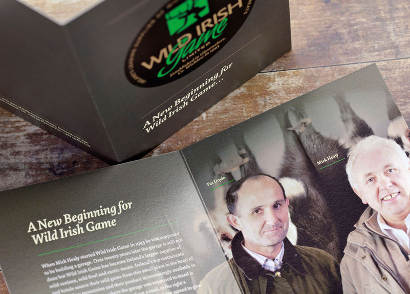
Wild Irish Game is a family run, Irish owned business supplying wild game, exotic and free range meats. When the business changed hands last year, we were approached by the new owners, also running a family business, to help manage the brand’s transition. We very quickly established that the respect and esteem in which the brand was held was inextricably linked to the ethos and ethics of its owners, and the strong relationships with customers that had been built over decades. As both the original and new owners shared a strong sense of personal pride, respect and professional judgement it was essential to instil these values in the relaunched brand. We developed an evolution of the existing brand, retaining the colour palette in particular to ensure existing customers recognised it as a natural progression. Subtle refinements to the colours, along with the introduction of raw natural materials helped emphasise the ‘forest’ flavour of the meats. In practical terms, the real challenge of the packaging was to create a one-size-fits-all treatment suitable for over 100 products of varying size and shape. We produced two universal labels which can be overprinted as needed and raw, uncoated packaging formats for trays and boxes. These, combined with premium, high-end foil and embossing print effects, perfectly communicate the high quality yet still cottage industry nature of the business.


![dfm portfolio crops jun23 [Recovered]-07.jpg](https://static.wixstatic.com/media/d1c4c1_1797fa198fe940c1ad9e339738f8dd69~mv2.jpg/v1/fill/w_801,h_574,q_90,enc_avif,quality_auto/d1c4c1_1797fa198fe940c1ad9e339738f8dd69~mv2.jpg)


